0 Comments
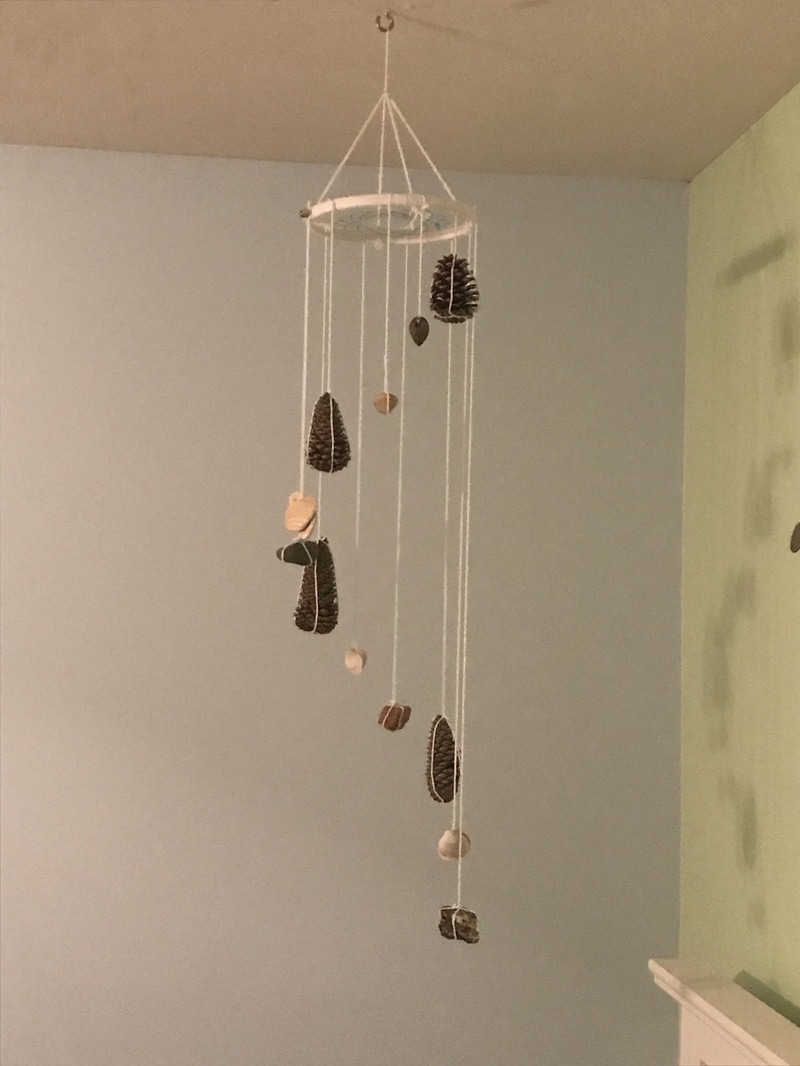
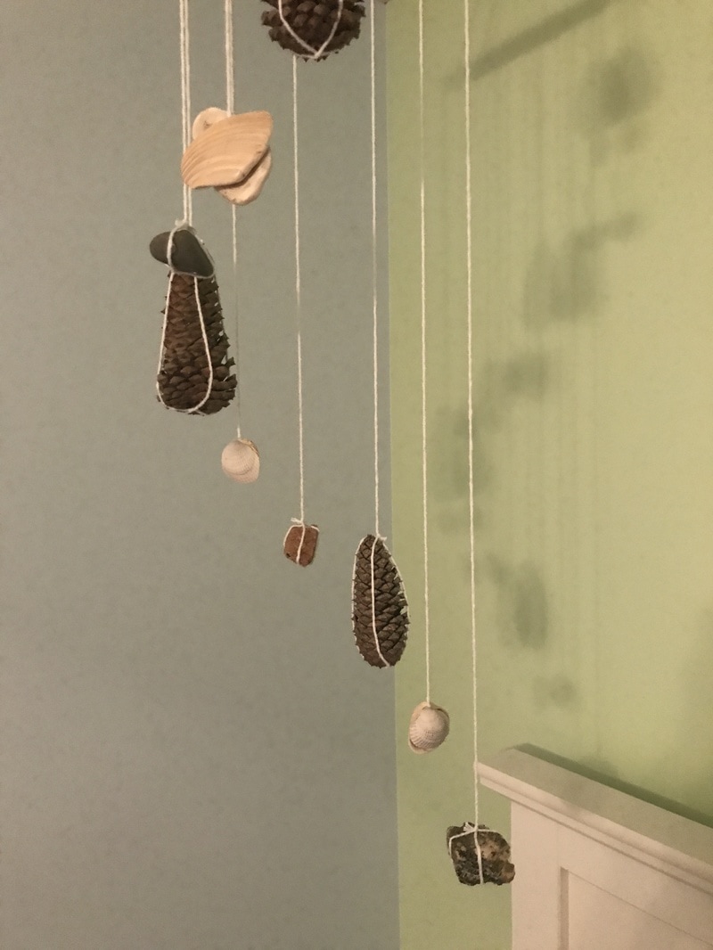
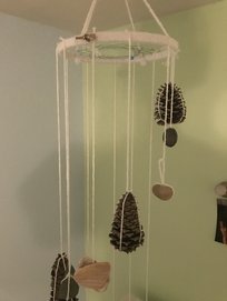
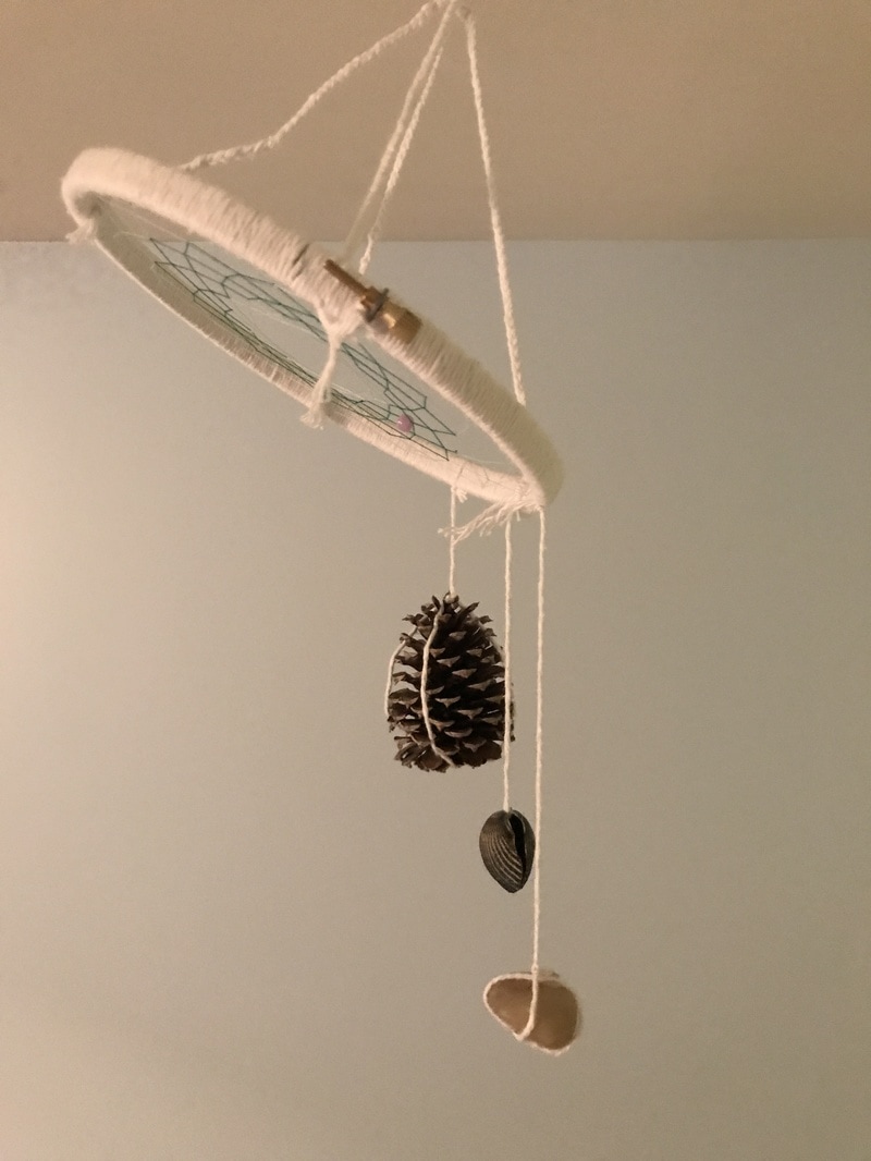
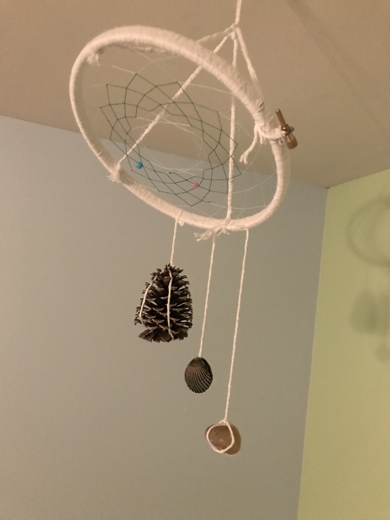
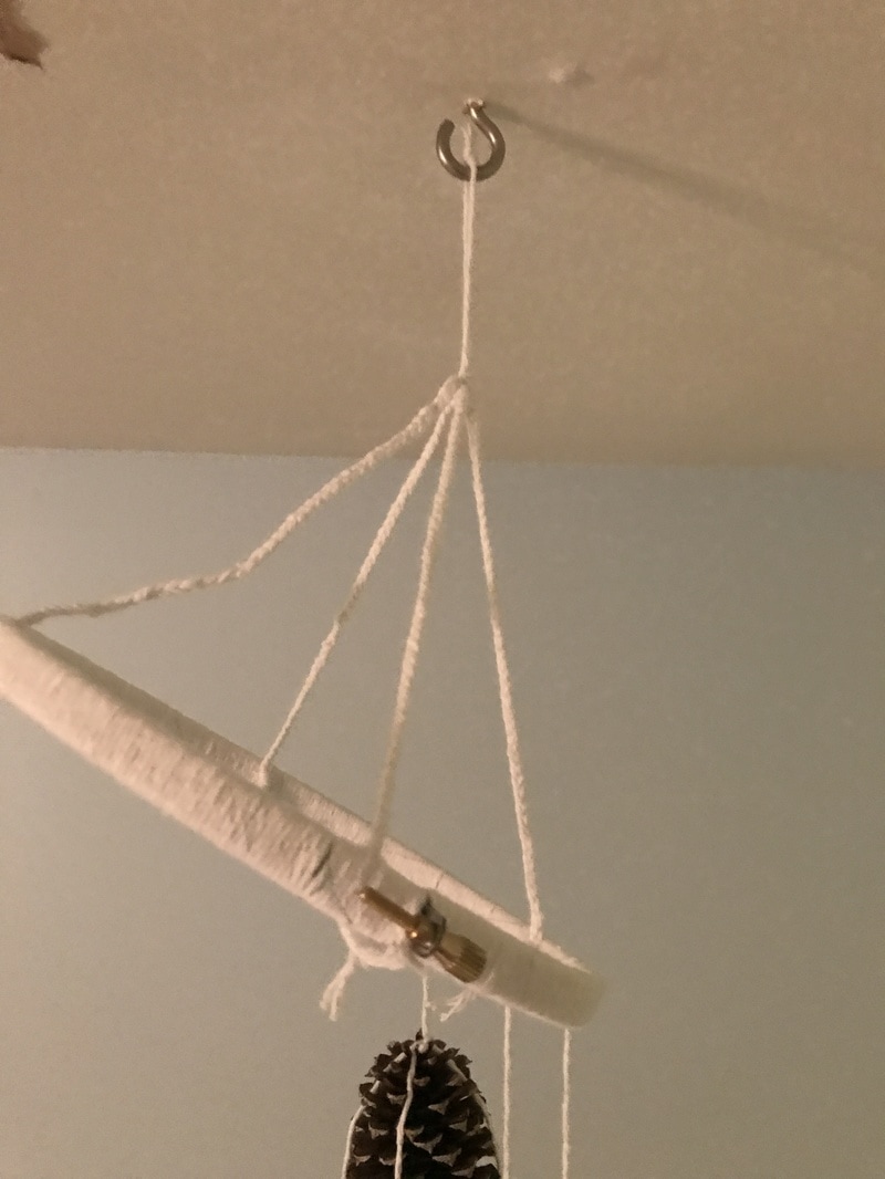
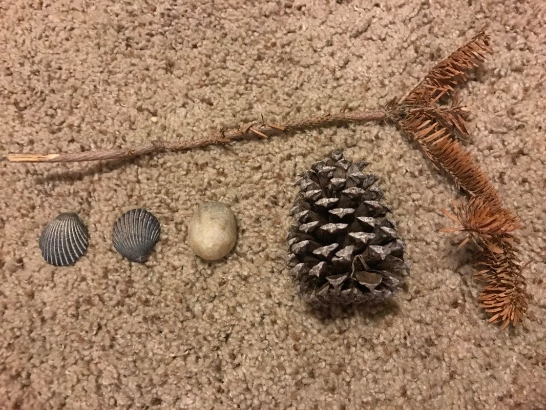
Here you can see how I have attached some of the hanging elements of the sculpture. As of right now, the mobile itself is slightly crooked due to the weight on a single side of the hoop, but once all of the hanging elements have been added, the top of the mobile will hang level. I had another found object, a stick that I was going to use, but I felt as if the long stick would class with the more roundish appearances of the other hanging elements, so I decided not to use it. In terms of future elements to hang from the hoop, I am contemplating creating a pattern of pine cones, shells, and rocks instead of forcing myself to find a completely different object for each hanging piece.
First of all, I apologize for the not-so-great quality of the pictures. I promise that I will eventually find a place in my house to take pictures of my art progress without having it look like I'm already living in debt from paying for art school.
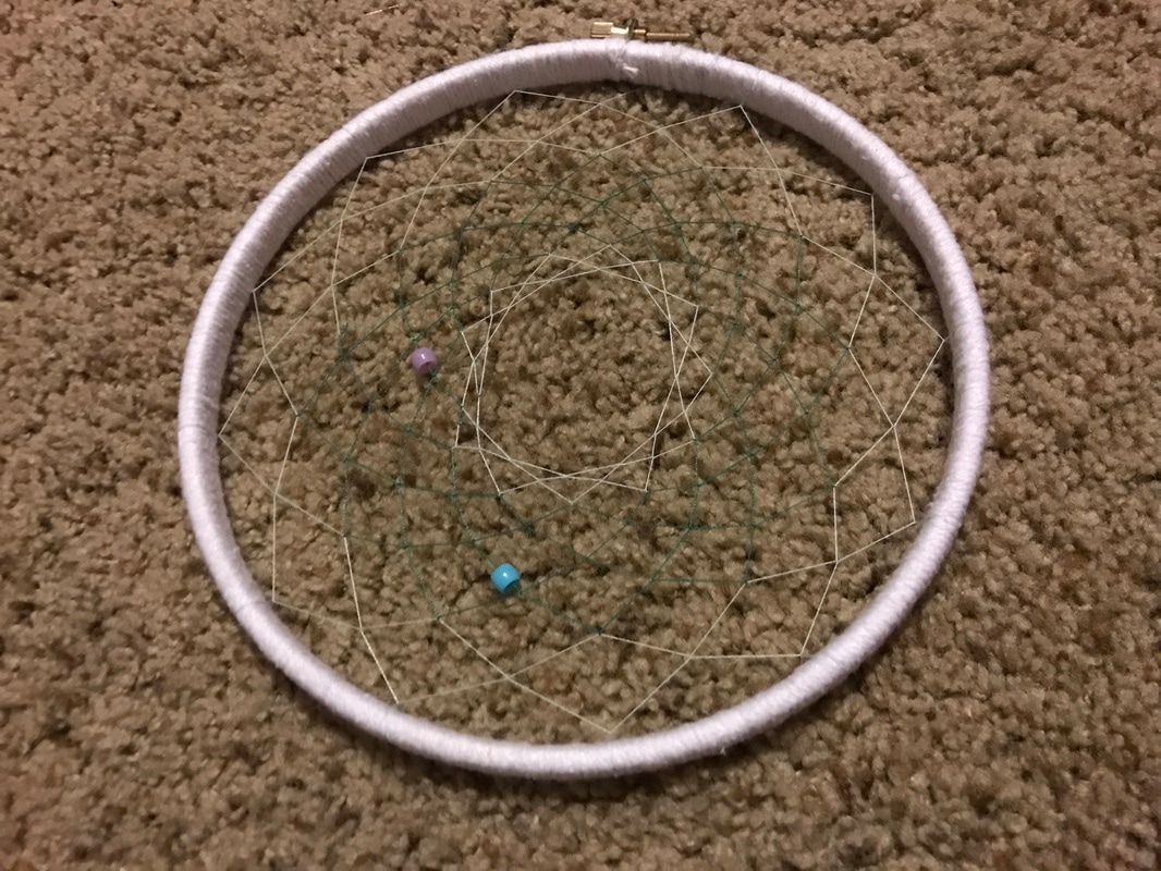
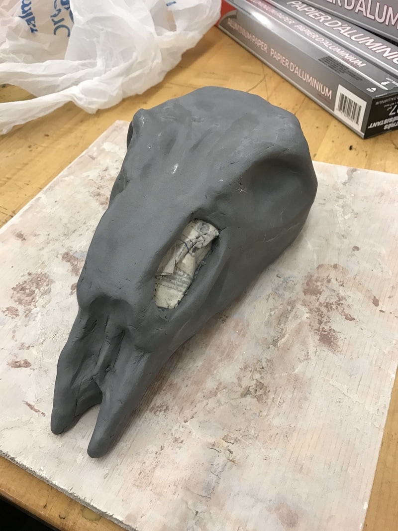
Anyway, for my sculpture I have a vision of having my sculpture being a hanging mobile. So what I'm planning on doing is using the hoop that I weaved a dream catcher into and hanging different found objects from nature from the hoop to form the basic structure of the mobile. While making this I want to really capture the sense of environment and have the elements of the mobile to work cohesively, which would exemplify the unity of the over piece. Because of this I am going to have the pieces hang in a spiral formation to create a sense of continuity that the viewer's eye can follow when they observe the mobile as it hangs. For this project, we were assigned to create a sculpture with a certain theme or content in mind while creating it. Boiled down to one word, the theme that I worked with was "mortality". I wanted to portray the duality between life and death in this sculpture, but I wanted to deal more with the life being cut short, which is why I had my theme be "mortality" instead of "death".
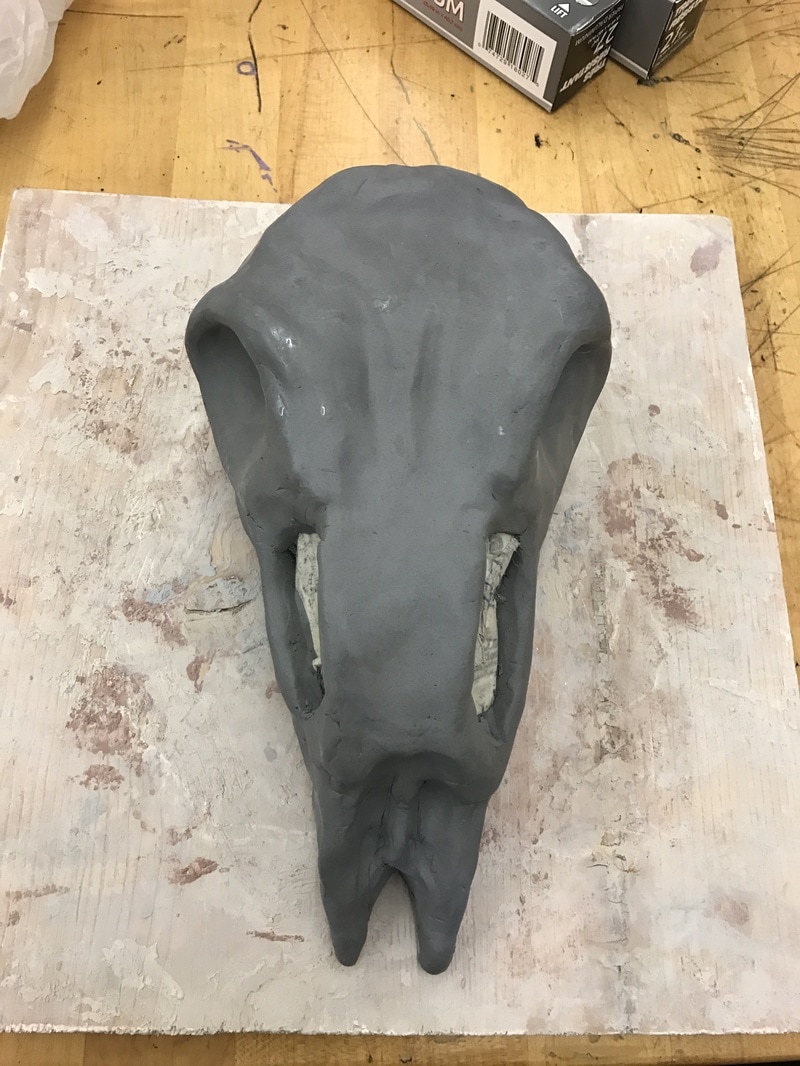
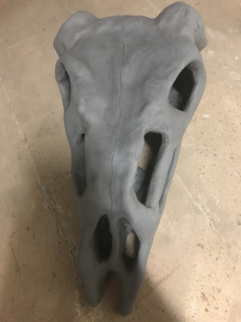
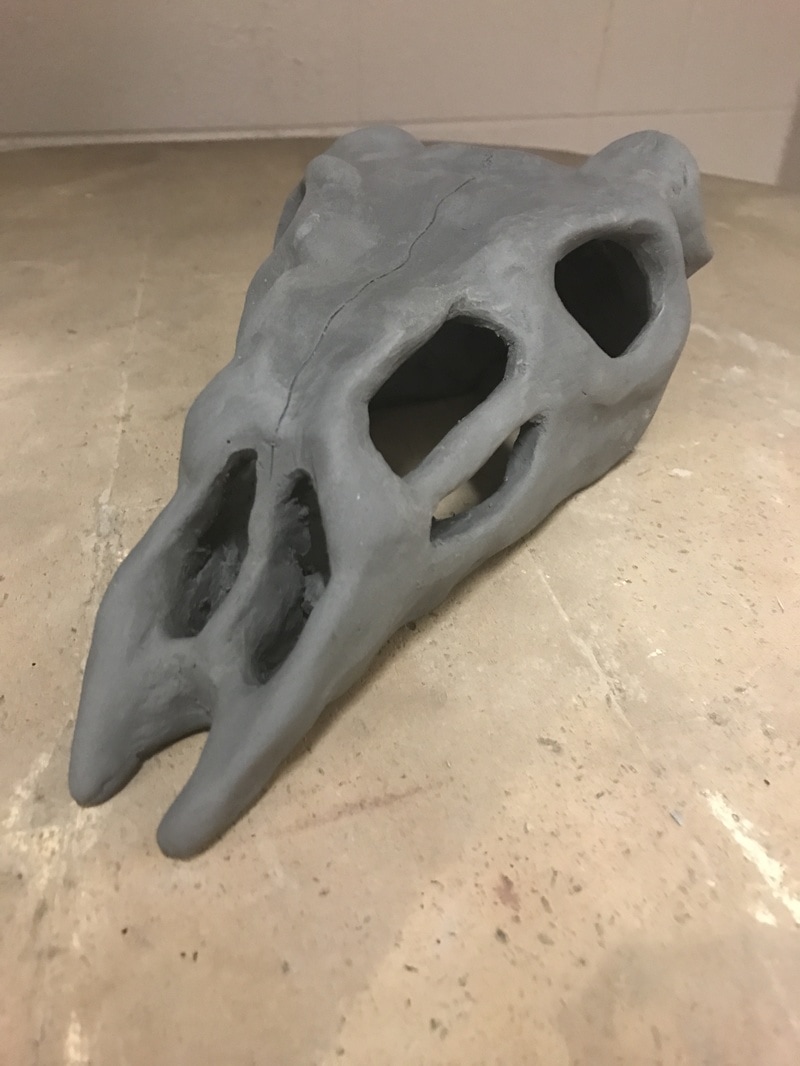
Because of my theme I wanted to use a deer skull to represent the aspect of death in mortality, but I was unable to find a real deer skull to use, so I created one out of clay. I had the color scheme of the sculpture consist of black, red, white, and gold since I wanted the color scheme to be darker with the white and gold as accents to the darker components of the sculpture.  Biographical Information Name: Kiki Smith Birthday: January 18, 1954 in Nuremberg, Germany Lives: New York Known for: Drawing, Printmaking, Sculpture Notable Works: Sleeping Woman with Standing Wolf (2004), Wolf Girl (1999), and Lilith (1994) Kiki's father was also an artist, and her mother was an actress. At an early age, Kiki was exposed to her father's geometric sculptures, which partially served to inspire her to become an artist. Also as a child, Kiki was a member of the Catholic Church, which also spurred her inspiration for art as well as feed her interest in the human body. Her family moved to the United States when she was still and infant, and she ended up attending Hartford Art School in Connecticut for college. After eighteen months attending the school, she moved to New York and joined an artist collective called Collaborative Projects. The radical materials used in this group can be found featuring in her current works, showing the influence that the group had over her artistic style. Unfortunately, Kiki's father passed away as well as her sister from AIDS, which most influenced the themes and content in her work. With this, her themes of birth, sex, and regeneration became very prevalent in her works. Later in her life, Kiki started creating works that were based on fairy tales and myths, with the "abject" figure of her previous works falling away. Despite this, she still has an aspect of feminism present in her art, though it is less central than in her previous works. When asked about her work, she commented that it is, "...no longer linear and the narrative imbued in them has fallen apart." 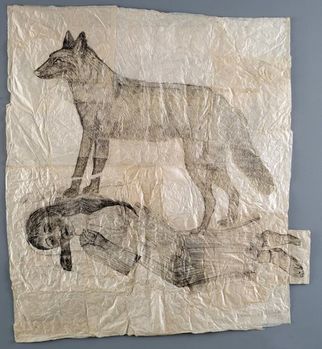 Sleeping woman with standing wolf 2004 Collage, lithographic print on rice paper 175 x 200 cm Museum of Modern and Contemporary Art of Trento and Rovereto Sleeping woman with standing wolf is reminiscent of Kiki's early printmaking works before she started to specialize in sculpture. The human and animal figure present in the print reflect Kiki's themes around the human body as well as the relationship between humans and nature. Additionally, the figure being a woman shows how the female figure is ever-present in Kiki's prints and sculptures. 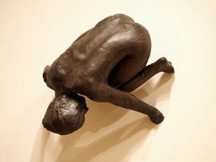 Lilith 1994 Silicon bronze and glass 33 in. x 27 1/2 in. x 19 in. (83.82 cm x 69.85 cm x 48.26 cm) Metropolitan Museum of Art This sculpture more reflects Kiki's content concerning women's rights and how the world views women. She does this by giving Lilith striking glass eyes to contrast the bronze of the rest of the sculpture. Despite being crouched against the wall, this makes her look as if she is ready to pounce on the viewer instead of cowering away, which takes away from the passive female stereotype. Questions:
View the video below to learn more about Kiki's content and how her art and habits have developed over the years. Sources:
http://www.mfa.org/collections/object/lilith-35875 http://www.pacegallery.com/artists/442/kiki-smith http://www.artnet.com/artists/kiki-smith/ https://www.guggenheim.org/artwork/artist/kiki-smith
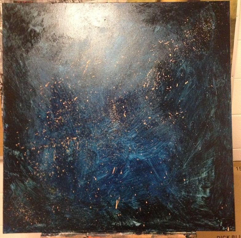
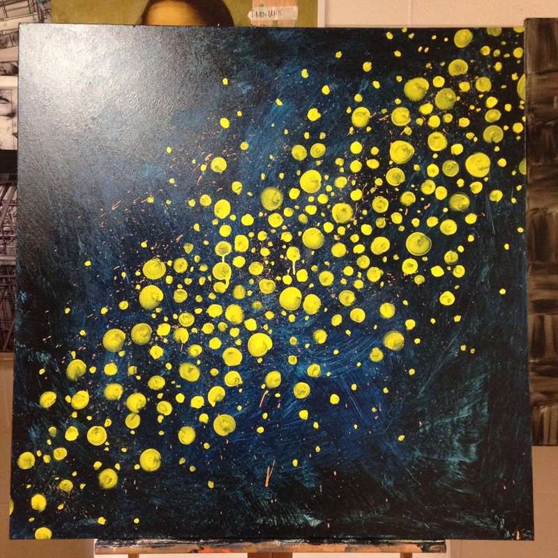
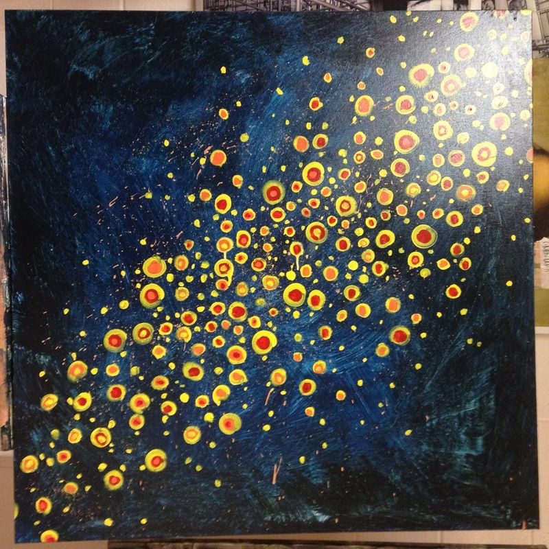
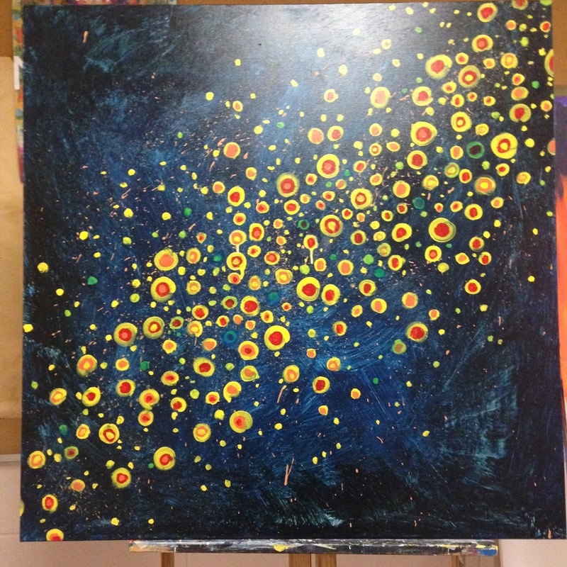
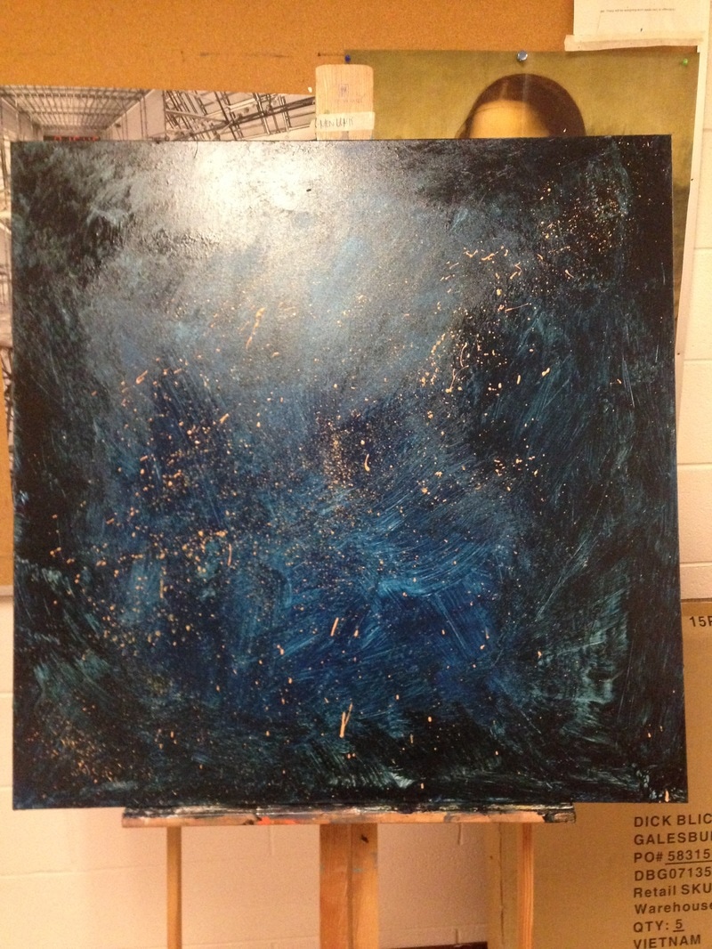
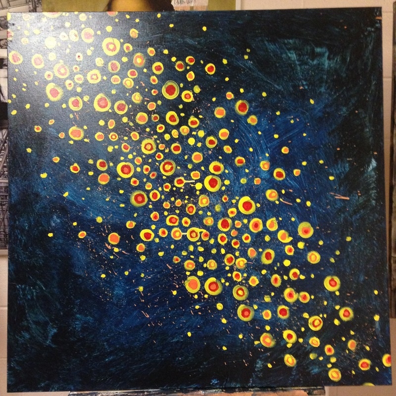
My apologies, but I made an entire abstract painting without any updates. Now, before there are riots, this is because overall the painting took approximately four class periods to complete, so this didn't allow for a substantial update to be posted after every class period. Because of this, I'm doing a full post now. For starters, I wanted to use a lighter coat of the black and blue house paint in order to have the texture of the background be more visible, allowing for some of the blank canvas to show through at some areas. Additionally, I applied darker paint to the edges and made the center lighter in order to also draw the eye into the center of the painting.
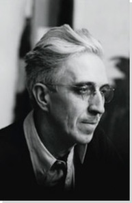 Biographical Information Name: Clyfford Still Born: November 30, 1904 Died: June 23, 1980 Time Period/Artistic Style: Abstract Expressionism and Modern Art Notable Works: 1948-C, 1944-N No.2 (also known as 'Red Flash on Black Field') Lived: Grandin, North Dakota Occupation: Professor at California School of Fine Arts (now San Francisco Art Institute) Clyfford was one of the first out of his contemporaries to create art devoid of a clear subject. His art mainly consisted of colors interacting with each other in order to convey meaning rather than strict subject material. Overall, his works have a theme of existentialism which captures the conflict between human spirit and the forces of nature. Thanks to the color compositions of his works, most of his art has been compared to an abyss with hints of light escaping. This is due to the fact that he favored using heavily contrasting colors with many of his works being very darkly colored with hints of contrast. Clyfford's art later also inspired a non-representational art movement among his other modern art contemporaries. 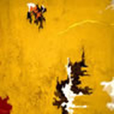 1948-C (1948) Oil on canvas 81 x 71 inches Hirshhorn Museum and Sculpture Garden, Smithsonian Institution, Washington, D.C. This work of Clyfford's is quite representative of the culmination of his art career, for distinguishable figures have disappeared completely and have been replaced instead by contrasting colors. In addition, this shows how he favored using heavily contrasting light and dark colors. He is quoted as comparing these colors to "life and death merging in fearful union."  1944-N No.2 (also known as 'Red Flash on Black Field') (1944) Oil on canvas 8'8" x 7'3" Museum of Modern Art, New York This painting was influential in Clyfford's transition into non-representational art. The painting lacks a clear subject matter, but has this strongly contrasting vertical and horizontal relationship in terms of composition. In addition, this is one of the only copies of a painting that Clyfford ever made in his career, with the first copy being almost identical to the second one pictured here. "These are not paintings in the usual sense; they are life and death merging in fearful union. As for me, they kindle a fire; through them I breathe again, hold a golden cord, find my own revelation." ~ Clyfford Still
Sources:
https://www.moma.org/collection/works/80198?locale=en http://www.theartstory.org/artist-still-clyfford-artworks.htm#pnt_3
|
AuthorAs a student in the art department, all progress on future projects will be documented on this page. Archives
May 2017
Categories
|


 RSS Feed
